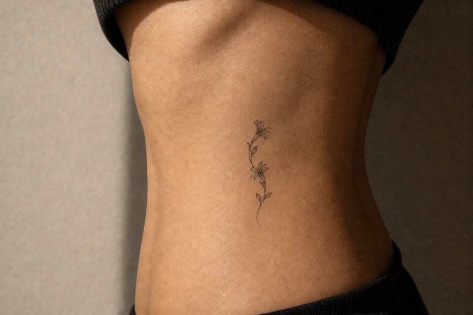
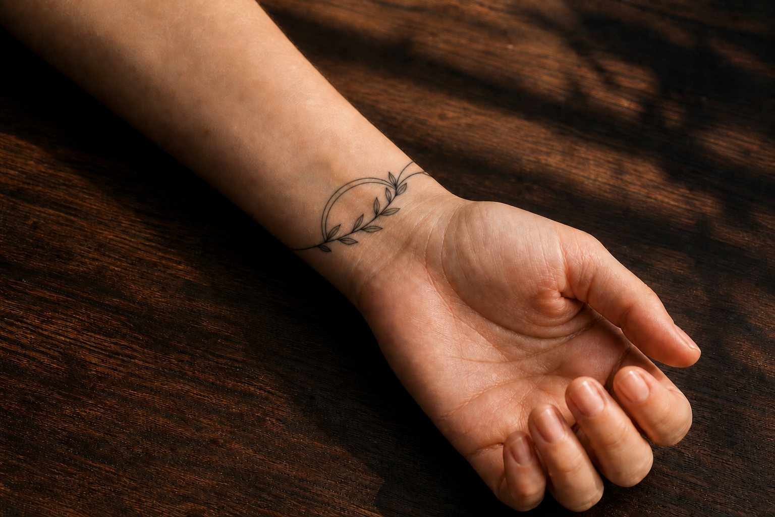
The wrist is often described as one small placement, but the inner wrist, outer wrist, side, and area extending toward the forearm offer different shapes and viewing angles. Planning begins by deciding how the design should relate to the hand, arm, watch line, and everyday movement.
Compare the available zones
Inner wrist
This area can make a tattoo easy for the wearer to see. Compact symbols, short horizontal gestures, and small pieces of lettering are common starting points, but the artist should determine appropriate scale and exact position.
Outer wrist
The outer plane may suit a design intended to read as part of the forearm. Consider whether the subject should face toward the hand, elbow, or viewer when the arm rests naturally.
Side wrist
A narrow line of space can support a short word, stem, route, or abstract gesture. Do not force a wide composition into this strip simply because the final tattoo is meant to be small.
Above the wrist crease
Moving slightly toward the forearm creates more room and can change how the design interacts with jewelry or clothing. Ask the artist to show possible positions without treating the first imagined point as fixed.
Let the plant decide the direction
A short olive sprig can sit across the inner wrist, while a fine vine may need to travel toward the forearm. A round flower head behaves differently from a narrow fern tip. Print the botanical at two sizes and rotate it around the wrist before choosing an orientation. Check the result with the hand relaxed, bent, and holding an everyday object. The stem should feel connected to the arm rather than placed like a small label.
Match the design’s direction to the space
Compact marks can sit like punctuation. Linear subjects can follow the arm. Curved forms can respond to the transition between wrist and hand. A design may look different when the palm turns, so view placement references in more than one position.
Bring the artist an idea, not a predetermined stencil size. A small subject with lettering or internal detail may need more room than expected to remain readable in the artist’s judgement.
Plan for everyday visibility
Wrist tattoos are frequently visible to the wearer and may be visible in work, social, and formal settings. Test the location with a washable mark or paper shape for visual planning only. Notice it while typing, driving, wearing a watch, and letting the arm hang naturally.
Decide whether the design is primarily oriented for your own view or for someone facing you. Direction depends on the subject and on how you want to see the tattoo.
Questions to ask the artist
- What scale supports the detail in this subject?
- How would you orient it relative to the hand?
- Would shifting it toward the forearm improve the composition?
- How will it interact visually with a watch or bracelet?
- Can you show comparable healed work in your portfolio?
- Which details would you simplify for this placement?
Test the wrist in motion
A wrist tattoo moves into and out of view all day. Draw a simple outline with washable marker, then check it while typing, holding a cup, carrying a bag, and letting your hand rest naturally. A design that looks upright in a posed photo may turn sideways during the moments you see it most.
Compare the top of the wrist, the inner wrist, and a placement slightly toward the side. Watch where a watchband, bracelet, or sleeve cuff lands. Leaving a narrow gap can look cleaner than placing the tattoo exactly where an accessory repeatedly cuts through its main feature.
Orientation is personal here. Some people want the image upright to their own eyes; others want it upright to someone facing them. Photograph both options rather than deciding from memory. If the motif has no obvious top, the artist may be able to angle it with the forearm so it reads well from several positions.
Treat the wrist as several placements
The inner wrist, outer wrist, thumb side, little-finger side, and area just above the wrist crease each offer a different plane. Rotate your hand and notice how quickly the surface turns. A design centred in one angle can appear off-centre in another because the wrist is a moving joint, not a flat card.
Photograph the area with your palm up, palm down, and arm resting naturally. Bring those views to the consultation. The artist can decide whether the design should belong to one primary view or flow across the turn.
Audit the objects that live there
Wear your usual watch, bracelets, hair ties, work gloves, and sleeves while testing the placement. Measure where straps actually sit rather than guessing. A tattoo can intentionally peek from under jewellery, sit completely above it, or occupy the other wrist. Accidental overlap may make a small design feel cramped.
Think about desk edges, keyboard posture, exercise equipment, and other repeated contact. Ask the artist how those routines affect their placement and aftercare advice. Do not change medical or work equipment for the sake of a tattoo without appropriate professional guidance.
Choose who gets the upright view
Lettering, faces, flowers, and directional objects create an orientation question. A word can face you when you lift your palm or appear upright to others when your arm rests. Neither choice is universally correct. Decide whether the tattoo’s job is private reading, outward presentation, or natural alignment with the arm.
For symbols without a clear top, direction can still affect movement. A stem can grow toward the hand or elbow; a butterfly can travel inward or outward. Place paper versions both ways and view them in a full-length mirror.
Run a real-size, no-zoom test
Print the design at several widths and cut around the silhouette. Photograph it from normal conversation distance. Fine internal marks that look beautiful on a phone may merge when reduced. The solution might be more scale, fewer details, or a stronger outer contour rather than abandoning the subject.
Account for the wrist’s narrowest point. A circular emblem may need to sit slightly higher where the arm offers a broader plane. A long phrase may fit better along the forearm than wrapped around the joint. Let the form and anatomy negotiate.
Small can still have hierarchy
Give one feature visual priority. In a flower, it may be the petal silhouette; in a butterfly, the outer wing shape; in a word, the characteristic capital or ending stroke. Supporting details should not compete at the same darkness and scale.
Be honest about visibility
Wrist tattoos are often described as discreet because they are small, but the area is frequently visible while speaking, paying, typing, or reaching. Covering it may require a watch, bracelet, or longer cuff, none of which works in every setting. Test your own wardrobe and decide how much explanation you welcome.
Frequent self-visibility can be the point. If the tattoo is a reminder, place the rough design where your eye naturally lands and live with it for several days. Notice whether the position feels grounding or visually busy beside the hand.
Check the stencil in motion
- Relax the hand instead of holding a posed flat palm.
- Turn the wrist through its normal range without forcing it.
- Look from your own view and in a mirror.
- Try the watch or jewellery position if the artist says it is appropriate.
- Take a normal-distance photograph, not only a close-up.
Approve the design that works during ordinary life, not just the angle in which it was drawn. A successful wrist tattoo respects movement, daily objects, and the intended audience while giving the image enough room to remain itself.
Try a two-week location test
Mark the proposed footprint with a small piece of paper or skin-safe temporary option on several non-consecutive days. Change watches, sleeves, exercise, and work routines normally. The aim is not to imitate the tattoo but to notice when the area is covered, bumped, constantly watched, or forgotten.
Keep the size constant during the first week, then try one slightly larger version. Many people discover that the larger silhouette looks calmer because it is proportioned to the hand and forearm. Bring the photographs and observations to the artist, but let their experience guide the final placement.
At the end of the test, write three notes: the view you liked most, the object that interfered most, and the feature that became unreadable first. Those observations are more useful than saying the wrist “felt too small.” They let the artist move the design a little higher, rotate it, open a gap, or recommend another site while keeping the original purpose.
Delete posed photos that hide the watch line or twist the wrist. Keep the ordinary ones. They represent the body context the final decision actually needs.