
A patchwork sleeve grows from separate tattoos with open skin between them. The pieces do not have to match, but the arm usually feels calmer when size, spacing, and placement are considered before every gap is filled.
You can start with one small tattoo and still leave good options for later. A quick arm map, a few spacing rules, and honest notes about the styles you enjoy are enough to avoid accidental crowding.
Decide how connected the sleeve should feel
Some patchwork sleeves use one style, line weight, or color family. Others mix years of unrelated tattoos and rely mainly on spacing. Both can work. Decide whether you want a coordinated collection, a personal timeline, or an open arm that may never feel finished.
Do not invent a theme only because you think a sleeve needs one. A simple rule such as mostly black ink, clear gaps, and a mix of palm-sized and smaller pieces can create enough rhythm while leaving each tattoo free to carry its own story.
Give the butterfly a job in the collection
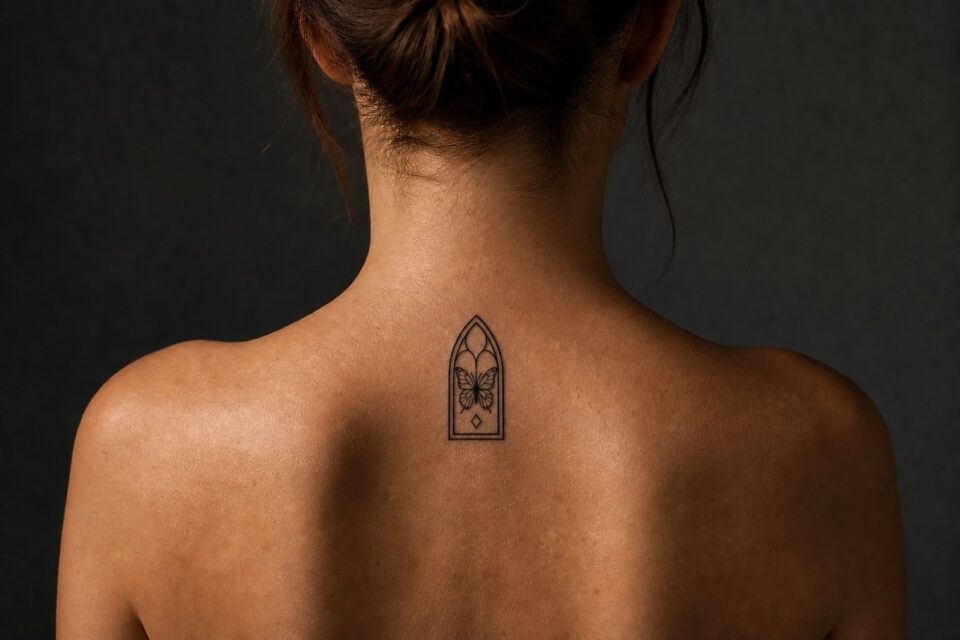
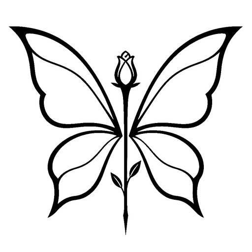
A butterfly can act as a wider anchor, a small turning piece near the elbow, or a quiet connector between two subjects. Decide which role it has before choosing the wing spread. Do not add several tiny butterflies only because narrow gaps remain. One well-placed specimen with a clear silhouette can create movement across the arm while leaving enough open skin for later decisions.
Map the anchor spots first
Photograph the arm from the front, back, inside, and outside. Mark the areas you would be sad to lose, such as the outer forearm, upper-arm front, or a spot that remains visible in short sleeves. Those anchor areas should not be filled casually.
Joints and narrow gaps need extra thought. An elbow, inner elbow, wrist, and the taper near the forearm can change how shapes fit. You do not need to design the entire sleeve, but you should know which places may need a more adaptable subject later.
Choose a spacing rule
Consistent gaps can make very different tattoos feel related. The spacing does not need to be measured exactly, but a rough range helps. If one piece sits extremely close while every other gap is wide, it can pull attention for the wrong reason.
Leave more room around detailed or dark tattoos so they keep a clear edge. Tiny filler can be added later, but filling every opening with stars, dots, leaves, or sparkles can remove the open quality that made the patchwork approach appealing.
Plan for one artist or several
Working with one artist can create a steady visual language, but a collected sleeve may intentionally include several artists. Keep a simple record of line weight, color, approximate size, and how each new piece relates to the tattoos beside it.
Show the whole arm during every consultation, not only the empty patch you want to use. An artist needs to see nearby shapes and movement to place the stencil well. Be open to rotating, resizing, or moving an idea to protect the collection.
Let the collection change slowly
Live with each addition before filling the next opening. Photographs taken after the tattoo has settled can show whether the arm needs another anchor, a quieter gap, or nothing at all. The urge to make the sleeve look complete can lead to filler you did not really want.
Keep a simple list of future subjects instead of assigning every one to a fixed spot. A new artist may see a better placement, or one idea may need more room than expected. Saving flexible ideas makes the sleeve easier to grow around the body instead of a flat diagram.
If color may be added later, decide whether it should appear once as an accent or repeat across the arm. The same applies to heavy black shapes. One isolated dark or bright tattoo can be an intentional anchor, but it should be a choice, not a surprise.
Review the arm in the clothes you wear most. A sleeve edge can hide one tattoo and frame another, changing the visible balance of the collection. You do not need to move every idea for clothing, but it helps to know which pieces will act as the everyday focal points.
Give the sleeve one compositional sentence
A sleeve can contain many subjects and still need one clear premise. Write a sentence about how the eye should travel: “A night garden rises from wrist to shoulder,” “family objects appear along one route,” or “large black shapes open into lighter botanical space.” This is not marketing copy. It is a rule for deciding what belongs.
List every desired motif separately, then mark each as lead, supporting, texture, or optional. If six elements all need to lead, the project has not found its hierarchy yet.
Map the arm in zones and views
Photograph front, back, inner, and outer arm from wrist to shoulder with the hand relaxed. Add views with the elbow bent. Mark joints, existing tattoos, areas you want open, and the part most visible in ordinary posture. A sleeve is never seen as one flat rectangle.
Choose primary viewing moments. The outer upper arm may hold the main focal image, the inner forearm a quieter personal detail, and the elbow a transition. The exact plan depends on anatomy, style, and subject.
Plan focal points, rests, and transitions
Two or three major focal areas usually need different visual weight. Resting areas of open skin, softer texture, or simpler background let those focal points register. Filling every gap with an equally dark object can make the sleeve read as inventory rather than composition.
Use transitions that belong to the visual world
Leaves, wind bars, water, fabric, smoke, geometry, clouds, or repeated line direction can connect subjects, but the choice should suit the premise. Generic filler added late often reveals that the main pieces were never planned to speak to one another.
Treat existing tattoos as fixed architecture
Give the artist clear, unfiltered photographs and measurements of every existing piece. Discuss whether each should remain isolated, be framed, connected, reworked, or visually balanced from a distance. Do not assume background can solve every collision.
An artist may recommend leaving a gap, changing a new subject, or separating the project into a patchwork approach. A coherent sleeve can include difference if the spacing and visual weight are intentional.
Choose an artist for the whole project
Look for complete healed sleeves, not only individual close-ups. Study how the artist handles elbows, wrist endings, inner arm, shoulder transitions, and negative space. A strong single tattoo does not automatically demonstrate full-arm composition.
Discuss whether one artist will lead everything, whether collaboration is possible, and how unfinished stages will look. Confirm approximate session structure, rate, deposit terms, travel, and expected communication without demanding a guaranteed completion date.
Make each stage feel deliberate
Large projects unfold over time. Decide which focal area begins the composition and how later sections can connect. If finances, health, travel, or life pause the project, the completed stages should still look intentional rather than like random fragments waiting for rescue.
Keep a private project record with photographs, design decisions, source credits, session dates, and future notes. This helps continuity without posting every unfinished detail publicly.
Brief the system, then allow drawing freedom
Send the premise, ranked motifs, personal source material, full-arm map, existing-tattoo photographs, contrast preference, colour direction, and firm exclusions. Add complete sleeves from the selected artist’s own portfolio that show why you chose them.
The sleeve becomes one composition through hierarchy, rhythm, and body flow, not because every centimetre shares the same texture. Give the main images room to lead and the arm room to remain visible inside the work.
Set a colour rule early
Decide whether the sleeve is black and grey, full colour, mostly black with one repeated accent, or open to a controlled mixed palette. Existing coloured tattoos should be included in the discussion. The rule does not require every flower or object to use the same colours, but it gives the artist a way to connect distant sections.
If colour carries personal meaning, rank the fixed hues and let secondary tones remain flexible. Bring real objects or neutral-light photographs rather than relying on edited screens. Review healed large colour work in the artist’s portfolio to understand how they build rhythm across sessions.
Make a simple arm map showing where the accent first appears, where it repeats, and where it stops. Repetition does not require equal amounts in every section. One bright focal area and two small echoes may create more unity than colouring every subject.
If the project will take years, keep the palette record with the artist’s notes and session photographs. Products and choices may change, so the record is context rather than a guarantee. It helps later decisions remain connected without pretending the sleeve was completed in one sitting.