
“Single line” usually describes a drawing that appears to be made through one continuous gesture. It may be literally unbroken or visually constructed to feel continuous. The style is about the path of the line, not simply about making every subject as small or thin as possible.
Single line, fine line, and minimalist are different
A single-line design can use a delicate or heavier mark. A fine-line tattoo may contain many separate lines and considerable detail. A minimalist design may use several bold shapes. These qualities can overlap, but they answer different questions: path, line treatment, and amount of visual information.
When researching artists, use their own language and portfolio descriptions. Hashtags often combine terms loosely.
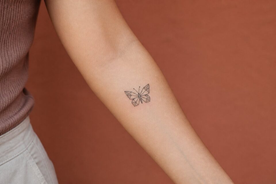
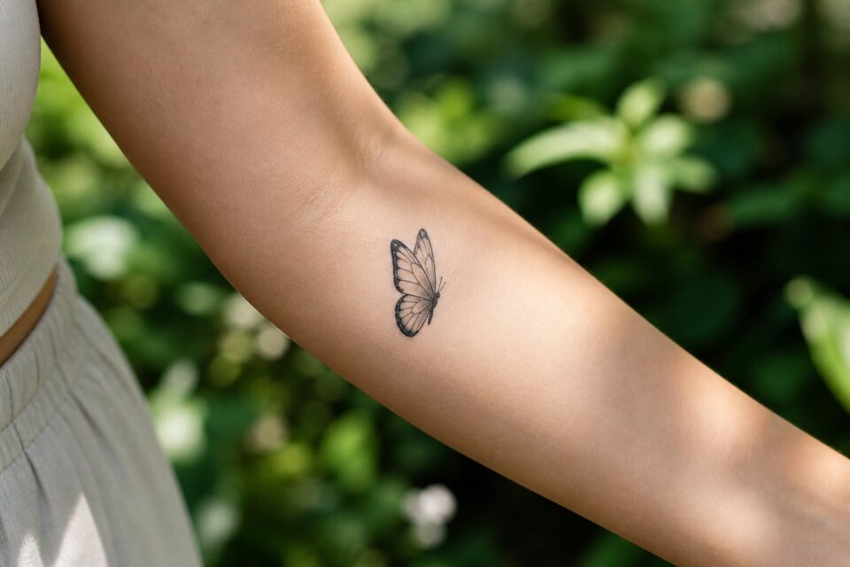
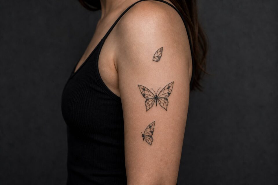
Find one continuous route through the butterfly
The line might begin at one antenna, travel around a forewing, cross the body, and finish at the opposite lower wing. It does not need to describe every compartment or force perfect symmetry. A side-view butterfly can produce a calmer path than a front-facing specimen. Ask which turn in the line makes the posture readable, then allow open skin to suggest the markings that were removed.
Choose a subject that survives reduction
Gesture-led subjects
Profiles, hands, animals in motion, waves, stems, and familiar objects may translate through a strong contour or movement. The key is identifying which gesture makes the subject recognizable.
Abstract relationships
Two people, a route, a memory, or an emotional shift can become a line that approaches, crosses, pauses, or changes direction. This leaves space for an artist to create a new symbol.
Letter and image combinations
A line can become a short word or initial, but forcing too many transitions may make the design feel like a puzzle. Choose one dominant idea.
Read the portfolio for composition
Do not judge only whether the line looks thin. Notice where it begins and ends, how it crosses itself, whether open space is balanced, and whether the subject remains clear without unnecessary detail.
Look for several examples, not one isolated post. If the artist shares healed work, compare pieces with similar scale and placement. Ask how they adapt a continuous-line concept when the body’s shape changes the drawing.
Describe your preference clearly
- Name the subject or story instead of supplying a finished tattoo.
- Identify the gesture that matters: curve, profile, route, connection, or movement.
- Say whether literal continuity matters or only the visual feeling.
- Describe the amount of abstraction you are comfortable with.
- Share placement and visibility preferences.
- Label references by line weight, spacing, or movement.
Give the artist room to decide where the line travels and which details it leaves out. That authorship is what keeps a simple visual idea from becoming a copied template.
Find the part of the line that carries the idea
A single-line tattoo does not have to prove that every part was drawn without lifting the pen. What matters is whether the path feels intentional. Trace the reference with your finger and notice where your eye slows down. A face may depend on the bridge of the nose. A flower may depend on the turn from stem to petal. Those are the moments worth protecting.
Then look for joins that exist only to keep the line continuous. A forced loop through empty space can distract from the subject, while a small break may make the whole drawing clearer. Ask for both versions if you are unsure. Comparing them at actual tattoo size is more useful than judging a large sketch on a screen.
- Remove decorative turns that do not help identify the subject.
- Check where two lines nearly touch and could visually merge.
- Leave breathing room around the main contour.
- Compare the design from arm’s length, not only close up.
The best edit is often one confident simplification. If the line still feels recognizable after a detail is removed, the design probably did not need that detail in the first place.
Decide what “single line” means in your brief
You may mean one physically unbroken path, a drawing that looks continuous but contains hidden lifts, or simply a sparse contour with very few marks. These are different constraints. Tell the artist whether continuity carries meaning or whether you mainly like the visual economy.
A literal one-path drawing can create awkward crossings when the subject does not naturally fit. Allowing a discreet break may produce a calmer design. The result can still feel like single-line work without turning the technical rule into the main subject.
Trace an action rather than a photograph
Single-line designs are strongest when the line has a reason to travel. Think of a hand reaching, a flower bending, a body turning, a pet curling, a route changing direction, or a thread looping through an object. Describe the action in a verb. The artist can use that movement to decide where the line pauses, overlaps, and exits.
If the source is your own photograph, identify the essential gesture. A literal outline of every edge often creates visual noise. One shoulder angle, nose bridge, leaf turn, or negative-space gap may be enough.
Give every crossing a job
Crossed lines can describe depth, join parts of a subject, or create rhythm. Too many crossings in a tiny area may look accidental. Mark which overlaps are necessary for recognition and let the artist reroute the rest.
Use empty sections deliberately
The line does not have to explain every contour. A missing edge lets the viewer complete the form and gives the design air. In a face, one eyebrow and jaw turn may imply the rest; in a flower, the gap between stem and petal can prevent a knot of ink.
Choose a body area that supports the path
A vertical line may follow a forearm, calf, rib, or spine. A looping compact subject may suit a shoulder, upper arm, or thigh. A long horizontal drawing can work near the collarbone or along a broader plane. Do not force the line into a square because the reference was posted that way.
Ask the artist to adjust the route on the body rather than treating the digital drawing as fixed. Curvature may widen one section and compress another. View the stencil in neutral posture and from enough distance to see whether the subject still resolves.
Discuss line weight without chasing thinness
Single-line does not automatically mean the thinnest possible application. A slightly stronger, confident path may support the design better. Some compositions benefit from subtle variation in weight, especially where one feature should lead. Use healed portfolio examples to discuss the quality you want.
If a reference looks delicate because it is large and surrounded by open skin, shrinking it may remove that effect. Compare actual-size versions. Delicacy can come from proportion and restraint rather than line width alone.
Avoid tracing the viral outline
Because single-line drawings look simple, the same faces, flowers, and bodies are copied repeatedly. Bring personal source images or describe a gesture that matters to you. If an online tattoo demonstrates one useful crossing or amount of space, label that quality and ask for a new composition.
Ask to see the artist’s drawing approach in their portfolio. A person who regularly solves forms with spare lines will bring authorship to the brief rather than mechanically converting a photograph with an effect.
Write a brief that leaves the route open
State the subject, action, source, continuity requirement, approximate scale, placement, and the one feature that must remain recognisable. Add two mood words and name what you are willing to lose. Do not pre-draw every turn unless you are commissioning your own drawing to be tattooed and have discussed authorship clearly.
The final line should feel inevitable only after the artist has edited it. Its simplicity is the result of choices about what to connect, what to cross, and what to leave for the eye to finish.
Check both the abstract and literal reading
Turn the draft upside down and look at it from across the room. Does it still have an interesting rhythm as a line, even before the subject resolves? Then return it upright and ask which feature makes recognition happen. A strong design often works first as movement and second as image.
If recognition requires an explanation of every crossing, the route may need editing. If the abstract shape feels good but no longer resembles the personal source, restore one characteristic contour. The artist’s task is to balance those readings rather than tracing an outline that is accurate but visually lifeless.
Make a black-paper test by viewing the line as a white path on dark paper or by mentally reversing figure and ground. This reveals cramped knots and dead ends that the subject image may distract from. You are not choosing a negative tattoo; you are checking whether the path leaves useful space around itself.
Mark the most important turn and the most expendable loop. That gives the artist a clear priority if body curvature requires rerouting during stencil placement.