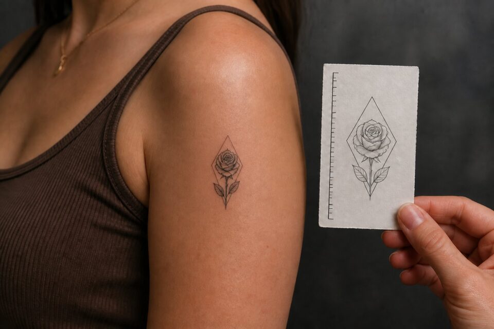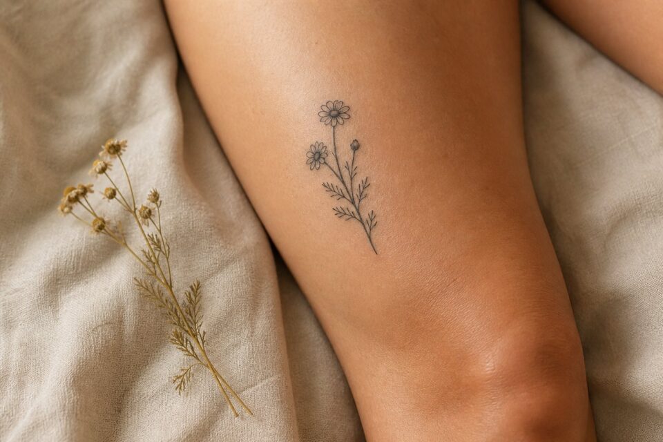
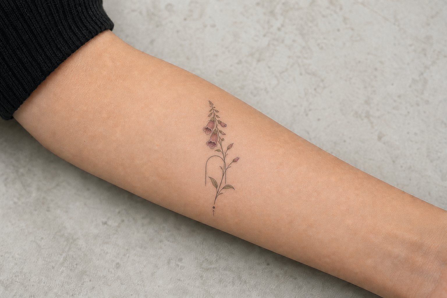
Small color tattoos need editing. A photograph may contain dozens of shades, reflections, textures, and background details, but a compact tattoo cannot treat every piece of information as equally important.
Choose the one thing the tattoo must communicate, then decide which colors and edges make that feature recognizable. A small color piece can still feel rich when the palette is deliberate and the background stays quiet.
Choose one clear subject
Flowers, fruit, insects, birds, small objects, and simple food or nature details can work well because they have recognizable silhouettes. A whole landscape, several figures, or a crowded still life may need a larger format or a much tighter crop.
Write one sentence about what must survive the simplification. It might be the blue edge of a pet’s collar, the orange center of a family flower, or the green glass of a familiar bottle. That priority gives the artist something concrete to protect.
Choose the colour that identifies the plant
A particular red rose, blue cornflower, or yellow daisy may depend on colour, but not every shadow from the photograph belongs in the tattoo. Pick the hue tied to the memory and one supporting dark or neutral value. Keep petal edges and open skin clear enough to separate the flower at normal distance. Bring several unfiltered photographs taken in ordinary light rather than one heavily edited close-up.
Build a limited palette
Pick a main color, a supporting color, and a dark or neutral anchor. The artist may add transitional shades, but starting with a hierarchy prevents every part of the design from competing. Open skin can act as light instead of another pale ink.
Bring original, unfiltered reference files when color accuracy matters. Screenshots, social filters, and compressed images can shift tones and remove useful detail. Tell the artist which color relationship matters instead of asking for a pixel-by-pixel match.
Use contrast and edges to protect the focal point
A small color tattoo still needs dark, mid, and light separation. The darkest edge does not have to surround the whole subject, but it should help the eye find the important form. Similar pale colors placed together can disappear into one soft area.
Not every edge needs the same sharpness. One crisp contour around the main feature, with a softer secondary petal or shadow, can create depth without stuffing the tattoo with lines. Ask how the artist handles small color boundaries in healed work.
Match the placement to the detail
Flatter areas such as the upper arm, outer forearm, thigh, or shoulder can give a compact color subject a clear main view. Narrow or high-movement areas may require a simpler crop. The artist should assess the exact body area instead of using a universal size rule.
Look for healed color tattoos shown in neutral light. Check whether the artist’s small pieces keep a readable focal point and clean color separation. Highly saturated fresh photographs can be appealing, but they do not answer the same questions.
Prepare a compact color reference brief
Place the unedited source image beside a simple note that names the focal point, main color, and details that may disappear. For a bird, that might be the head angle and one wing color. For a flower, it might be the petal silhouette and the dark center.
Add one body photograph showing the intended placement and normal clothing around it. This helps the artist judge how a small patch of color will sit on the body. Avoid drawing a fixed border on the skin photo, since the exact shape may need to change with the design.
Give the artist permission to crop, simplify, or move a color. Small color tattoos depend on value and separation, not on reproducing every shade. A brief that protects one visual memory and allows practical changes is more useful than a long list of compulsory colors.
If the color is linked to a real object, photograph that object beside a neutral gray or white surface in daylight. This will not create perfect color matching, but it gives the artist a more dependable source than a heavily edited social image or a written color name.
Choose one primary reference with honest colour
Select the image that best represents the subject’s proportions, expression, and light. Keep the original file. Heavy filters, screenshots, and artificial blur can remove information the artist needs. Supporting images may clarify another angle or colour, but label why each is included.
If several photographs show different colour because of lighting, say which memory or object is most accurate. The artist can interpret a palette more responsibly when the conflict is visible.
Rank recognition, emotion, and colour
Decide whether the tattoo’s first job is exact recognition, a particular expression, the atmosphere of the light, or a colour memory. These goals overlap but may compete at small scale. A pet portrait might need ear shape and eyes before background sunset colours. A flower may depend on one unusual hue more than every petal edge.
Give the artist three priorities and three expendable details. Editing becomes clearer when there is a stated order.
Question the background before adding it
A coloured haze, frame, flowers, or landscape can support a subject and help the composition fit the body. It can also make a small portrait crowded. Ask to compare a subject-only option with one contextual element.
Use open skin intentionally
Realism does not require ink in every area. Open skin can create light, separate forms, or soften an edge. Discuss how the artist uses it in healed work rather than assuming a photographic rectangle must be filled.
Let scale protect the subject
Faces, fur, reflective surfaces, architecture, and layered flowers contain different kinds of information. Ask the artist’s minimum recommended size for the exact subject. Compare printed versions without zoom and view them at normal distance.
A larger design can feel less heavy when colour transitions and negative spaces have room. Conversely, simplifying the crop may keep a piece smaller: a pet’s profile instead of the full body, one flower instead of a bouquet, or one object without a scene.
Choose a placement for shape and visual stability
Portraits and compact scenes often need enough width for proportion. Long subjects may use a limb’s direction. Curvature changes faces and circles, so identify the primary view during stencil placement. Show full-body context, not just a close crop.
Consider normal clothing and how much sun exposure the area receives after healing. For general care of healed tattooed skin, the American Academy of Dermatology recommends sun protection; follow your artist’s instructions for the healing period.
Compare the artist’s healed colour decisions
Look for the subject category, palette, scale, and body area you want. Study how the artist controls edges, contrast, skin breaks, and backgrounds. Fresh photographs reveal the initial piece; healed examples provide another necessary view.
Notice whether portfolio colour appears consistent across lighting conditions or heavily edited. Ask for normal-light healed work if you cannot assess it. The question is how the artist designs with colour, not whether every post uses identical photography.
Send a priority-led brief
Include the story, original primary file, labelled supporting images, three recognition priorities, essential colour, placement options, comfortable size range, and details that may be removed. Add relevant examples from the chosen artist’s portfolio.
Colour realism becomes personal through selection and emphasis, not by reproducing every pixel. Give the artist enough trustworthy information to decide what must remain sharp, what can soften, and where the body should replace the photograph’s frame.
Approve a colour proof by relationships, not exact screens
Digital displays and room lighting change colour. Instead of expecting a screen swatch to predict healed skin exactly, identify relationships: the flower should remain warmer than the leaves, the eyes should be quieter than the collar, or one red object should lead the composition. These comparisons survive display differences better than isolated codes.
Bring the physical keepsake or several neutral-light photographs if a hue is emotionally essential. Ask the artist how they interpret the reference within their palette and process. The aim is a coherent tattoo with the right visual priority, not a promise of identical colour across paper, monitor, fresh ink, and healed skin.
Create a small priority card naming the indispensable colour relationship and the details that may change. For example, “the scarf remains the warmest red; the background may shift cooler.” That instruction gives the artist a stable emotional anchor without turning the palette into an impossible digital match.
Review the card again at stencil approval because placement and scale can change how much colour the focal point needs. A smaller crop may require less background, allowing the meaningful hue to lead more clearly.
After approval, put away inspiration images that no longer affect the design. Comparing the final drawing with dozens of photographs can reopen settled choices without adding information. Keep the primary reference available for factual checks and judge the tattoo composition on its own terms.