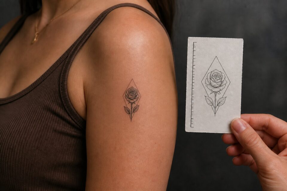
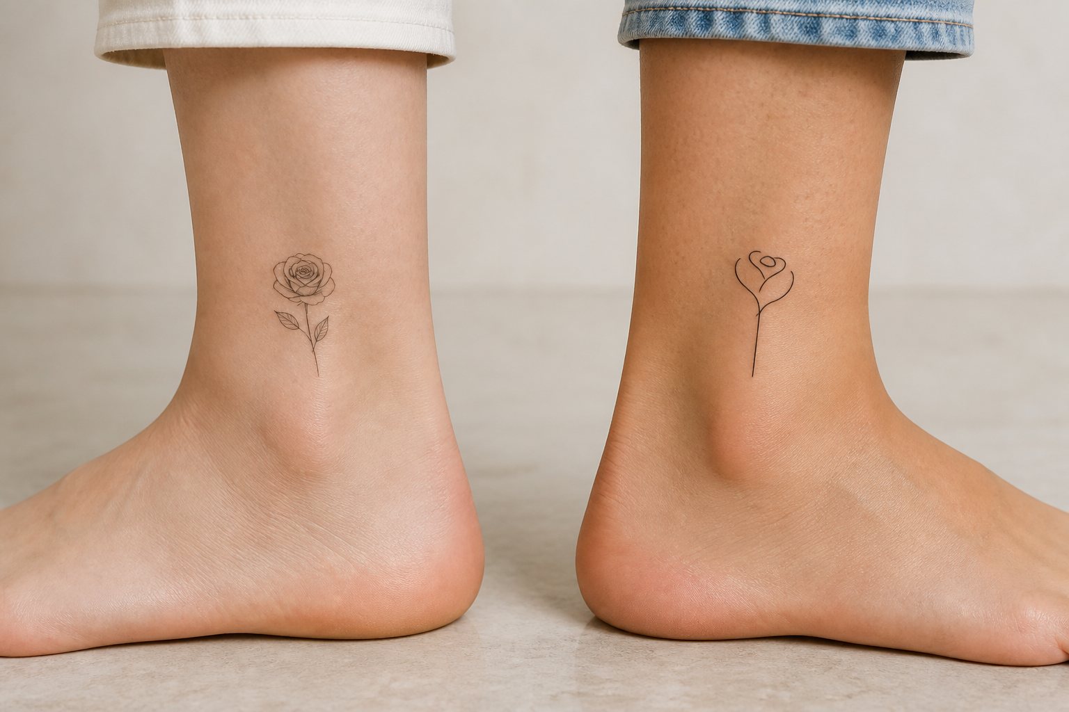
“Fine line” and “minimalist” are often placed in the same search for small flower and plant tattoos, but they describe different dimensions of a botanical design. One is primarily about line treatment. The other is about reduction and composition.
Fine line: a quality of the mark
Fine-line work uses delicate lines and may include considerable detail, shading, texture, or realistic drawing. A botanical illustration with many veins can be fine line without being minimalist. So can a small portrait containing dense information.
Minimalist: a quality of the composition
A minimalist tattoo reduces an idea to essential forms. A botanical version might keep one leaf contour, a stem and bud, or a compact flower silhouette. It does not have to be especially delicate. A bold black seed shape can still be minimalist.
Compare one rose in three directions
A fine-line rose study might keep the folded petals, changes in line weight, two leaves, and a little stem texture. A minimalist rose may reduce the same specimen to one outer contour and a single turn that suggests the centre. A mixed approach can use a stronger silhouette with two fine interior folds. Print all three at the size you are considering. The comparison shows whether you care most about the species, the gesture of the flower, or the open shape it makes on the body.
Use a photograph of an actual rose as the common source. Otherwise, changing both the reference and the drawing style makes it difficult to understand what the style choice is doing.
Compare the right parts of an artist’s portfolio
- Look for repeated control in the line quality you prefer.
- Notice whether small compositions still have clear hierarchy.
- Find examples with flowers, leaves, stems, and scale similar to your botanical idea.
- Read the artist’s own description of their style instead of relying only on hashtags.
- Ask whether they consider the design suitable for the intended placement.
Describe your preference without forcing a label
Useful phrases include “delicate line with open space,” “simple geometric reduction,” “botanical detail without heavy shading,” or “a compact silhouette, not an outline.” Visual language gives an artist more information than saying only “fine-line minimalist.”
Combine the qualities without confusing the terms
You may want fine line without minimalism: a delicate botanical with many leaves, overlapping petals, or a textured seed head. You may want minimalism without fine line: a bold leaf silhouette, thick stem curve, or compact flower shape.
Describe what you see
Replace labels with observations. Note line weight, amount of detail, contrast, open space, edge quality, and degree of abstraction. “Fine-line minimalist” gives less information than “delicate outline, no shading, one asymmetrical break, and generous open space.”
Compare three portfolio dimensions
- Mark: thin, varied, bold, smooth, textured, or gestural.
- Composition: reduced, detailed, symmetrical, open, dense, or layered.
- Subject treatment: literal, symbolic, geometric, or abstract.
Use these dimensions to find artists whose repeated work fits your preference. One image may be an exception; a portfolio shows the visual decisions an artist makes consistently.
Let scale remain part of the consultation
Neither “fine line” nor “minimalist” automatically means tiny. Ask what size supports the subject, placement, and artist’s approach. Simplicity should come from design choices, not from compressing information until it disappears.
Write two separate briefs
“Fine line” describes how the tattoo is drawn. “Minimalist” describes how much the design contains. To see the difference, write one brief that keeps your full subject but asks for lighter line work, then a second brief that reduces the subject to its few essential shapes.
Compare what each version gives up. The fine-line botanical may keep veins, folds, thorns, or several petals while relying on delicate marks. The minimalist version may remove those details but use a stronger plant contour. Either can be small, and either can become busy if too many ideas are packed into it.
Show the artist the subject reference first, then the two briefs. Ask which approach suits the body area and the scale you want. Their portfolio should help you see whether they are comfortable with the kind of restraint involved. A design is not automatically minimalist because it is tiny, and a thin needle does not automatically make a clear small tattoo.
Separate the subject, the drawing, and the application
People often use “fine line” and “minimalist” as if they name the same thing. They answer different questions. Minimalist usually describes how much visual information a design uses. Fine line describes the narrow line quality or needle-grouping approach visible in the work. A minimalist tattoo can use bold lines, and a fine-line tattoo can contain dense shading, ornament, and realism.
When contacting an artist, describe what you can see instead of relying on a label. Say that you like open skin between elements, one continuous contour, soft grey shading, a solid black silhouette, or a small detailed study. Visual language is less ambiguous than a style tag that different studios may use differently.
Four combinations that clarify the choice
Minimal information, fine line
This might be a spare flower contour, one curved stem, or a leaf and bud with a lot of open skin. Every line is exposed, so proportion and placement do much of the work. It suits a simple idea, but “simple” does not mean easy to draw well.
Minimal information, stronger line
A small black flower, simplified herb silhouette, or bold seed shape can still be minimalist. The design reads from farther away and may feel more graphic than airy. This is worth considering when the motif’s identity lives in its outer shape.
More information, fine line
Botanical studies, micro portraits, architectural details, and ornamental compositions may use thin lines while carrying many elements. These designs often need more physical space than their delicate appearance suggests. Ask what the smallest responsible scale is for the artist’s drawing.
More information, mixed line weights
A piece can combine a stronger outer contour, finer internal marks, solid areas, and soft texture. Mixed weight creates hierarchy and may preserve the feeling of delicacy without asking every part to be equally thin.
Audit a portfolio without being distracted by zoom
First, look for healed photographs. Then compare pieces at a size close to what you want. Note whether the image is shown in ordinary light and whether enough of the body is visible to judge scale. An extreme close-up can make a two-inch tattoo look like a poster; a full-limb view tells you how it actually reads.
Look for the subjects you care about. An artist excellent at fine botanical lines may not be the right person for tiny lettering or a geometric symbol. Technique, design judgement, and subject experience overlap, but they are not interchangeable.
Also notice editing consistency. Perfectly black backgrounds, heavy sharpening, and only fresh photographs can make comparison difficult. This does not prove poor work, but it is a reason to ask politely for healed examples during the consultation.
Edit the idea before reducing the drawing
Write every element you hope to include, then rank them as essential, supporting, or optional. A minimalist result comes from deciding what carries the meaning, not from shrinking a complicated scene. If the tattoo is about a grandmother’s garden, perhaps the essential part is the bent stem of one plant, not a miniature house, portrait, date, and bouquet.
Try describing the design in one sentence without adjectives. “A poppy stem turning around the wrist” gives a clearer structural instruction than “a dainty, meaningful, elegant, feminine fine-line tattoo.” The artist can ask useful questions about the first sentence.
Use the consultation to compare real options
- Ask to see the same concept at two possible scales.
- Discuss which lines are structural and which are texture.
- Ask whether a bolder contour or more open skin would help the design.
- Review the stencil from normal distance and with the body relaxed.
- Confirm that the artist’s proposed treatment matches examples in their own portfolio.
There is no prize for choosing the thinnest possible line or the fewest possible marks. The useful distinction is whether the botanical design needs restraint, delicacy, dense plant detail, graphic weight, or a deliberate mix. Once you name those qualities, the style decision becomes a conversation with an artist rather than a choice between two internet labels.
Rewrite five vague style words
Take words such as dainty, feminine, clean, timeless, and elegant, then replace each with something visible. “Dainty” might mean a narrow composition with plenty of open skin. “Clean” might mean no shading and three uninterrupted contours. “Feminine” may turn out to mean a botanical subject, a gentle curve, or simply a reference habit you do not need to keep.
This translation improves the enquiry and makes hidden assumptions easier to challenge. It also allows women with different tastes to find work that feels right without treating one thin-line aesthetic as the definition of femininity. The artist can respond to spacing, shape, contrast, and movement because those are design decisions rather than personality labels.
Save the rewritten list and use it while comparing portfolios. If an artist’s work repeatedly demonstrates the qualities you named, the style label matters less. You can also see when two desired qualities conflict, such as extremely small scale and intricate interior texture. That conflict becomes a useful consultation question instead of a disappointing surprise after the design is reduced.